I love swatching paints! Taking a new set of colors on a test drive helps me understand what they are capable of, discover the unique properties they might possess, learn how they handle and more importantly, help inspire new compositions! I’ve made multiple two page swatch spreads of paints from handmade paint makers, and in the process, my water control has improved exponentially. Read on to see how I plan and execute my swatch spreads!
Supplies:
- Sketchbook: I like to maintain an A4 sketchbook for my swatch spreads, so I have one place that holds all of them — no loose sheets that are hard to place; way easier to look up the colors you already have when trying to decide on whether or not to purchase that new color! I like using the cold pressed Etchr Perfect Sketchbook for my swatches.
- Paints: Any watercolor paints you’d like to make a spread of. I have used 6 colors from Kourtney Paints (Etsy) in my example. These paints are handmade and an absolute joy to use!
- Brushes: Any brush you’re comfortable with.
- Washi tape: If you’re like me and want clean, crisp edges, use washi tape to layout your spread. I use 3 mm washi tape for my spreads. I buy mine on Amazon.
- Water

Step 1: Pick a Layout
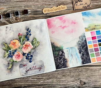
The number of paints I’m swatching usually plays a role in deciding how I layout my spread. I love being creative and switch things up constantly. I try to position the swatches and the paintings in a way that will have the most visual appeal, and avoid crowding as much as possible. Check out more of my spreads on #NiraSwatches for ideas on how to layout. See some examples in the picture below.

Step 2: Section the Paper
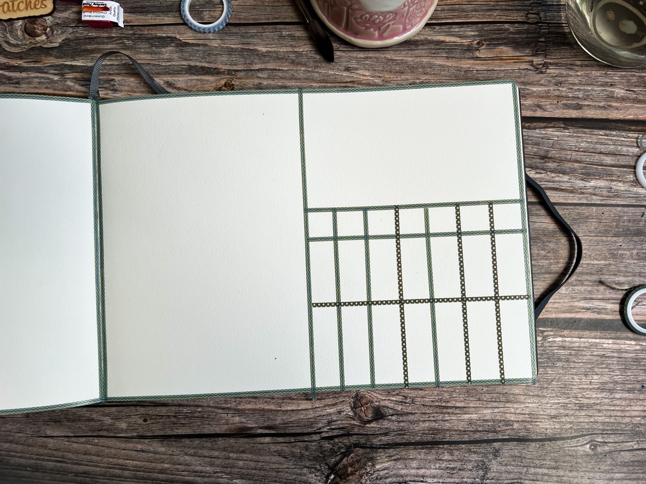
I always ‘eyeball’ these, I choose not to frustrate myself by measuring exactly. The end result is always beautiful, even when the lines are wonky. However, if you find joy in perfectly measured lines, then measure away, my friend!
The following images depict how I eyeball semi-accurately. For a mixing chart of 6 colors, I mark the middle first, making two sections; I then portion each section into 3 sections. I do this for the columns and rows (order is unimportant).


Step 3: Swatch the Paints
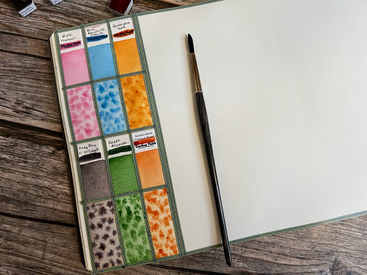
Now that we have our layout all taped out, it’s time to start swatching! Handmade paints usually come meticulously wrapped and labelled and I like to keep bits of it in my swatches. Looking through them, later, instantly reminds me of how beautifully wrapped they were and I get to relive the experience time and time again. In my example, I saved the labels and stuck them above each color swatch. This way, I also have a record of the maker and color name. If you’re using tube paints, you can write the name of the colors on the swatches once they have dried. Writing the names down first might result in them being covered by opaque paints.
My first swatch for each color is an even swatch. I like to do these without pre-wetting the paints. I can gauge how quickly the paints rewet from doing so. Please note that some makers mention specifically that their paints need to be pre-wet, especially, shimmer paints. In these cases, doing as directed might be a less-frustrating experience.

Step 4: Test Dispersion, Opacity, Granulation and Separation
Without rinsing the brush from the previous swatch, lay down the remaining color, picking up a little water if needed to facilitate a lighter wash. Load the brush with paint and drop-and-release a bunch of times to see how the paint disperses. This is very soothing to watch and one of my favorite things to do — just watching the pigments and water do their thing! Notice how the pink and blue disperse a little less wildly than the Quin. Yellow. This step usually helps you see how well a color granulates and separates too. Pretty exciting, right?
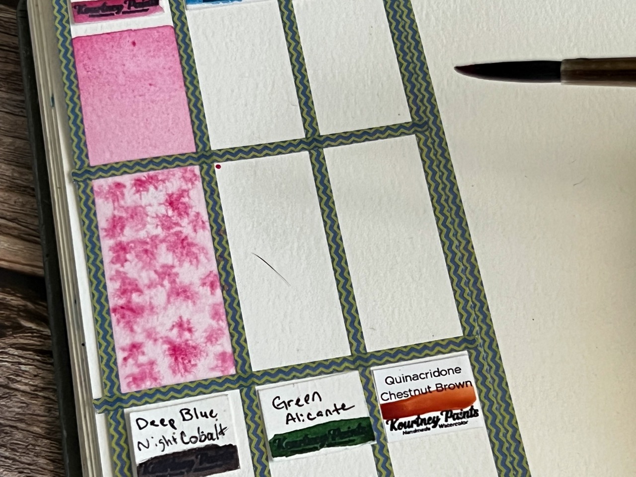

You can test opacity of the paints by drawing a black line using waterproof ink prior to swatching. If the line shows through after painting over it, the paint is transparent; if the line is fully covered, then the paint is opaque. Another thing you can try is to scrub the paint after the swatch has dried to see how staining the pigment is. The idea is to get to know your art supplies well and get familiar with their quirks!
Step 5: Start the Color Chart
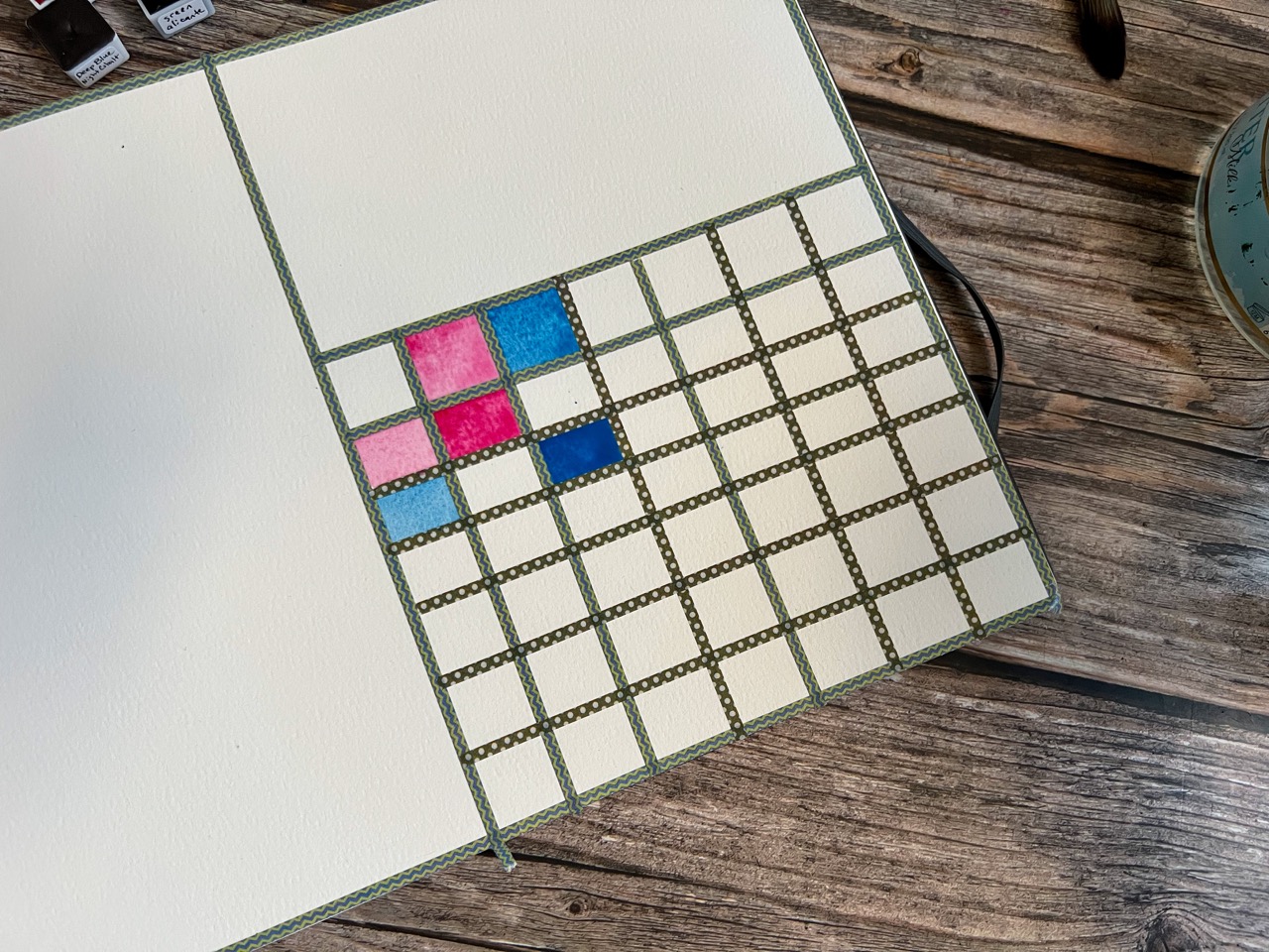
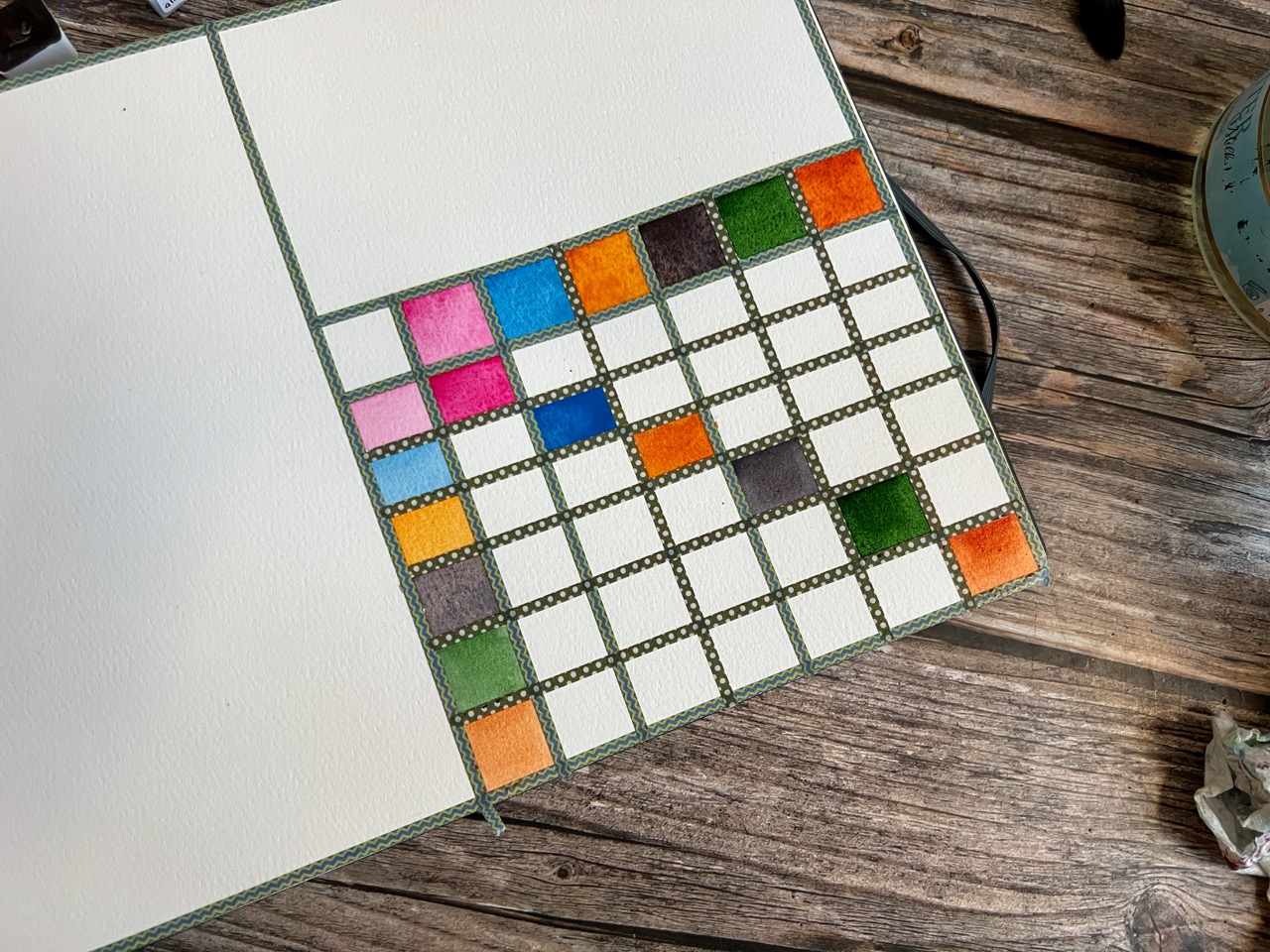
Now that we have the basic swatches done, let’s move on to making a color chart. Since I have 6 colors, I started off with 7 rows and 7 columns; the top row and the leftmost column have the colors swatched in their purest form, the remaining 6x6 grid will hold their mixes.
As I paint the colors in their purest form, I also fill in the box that holds a mix of the same. I like to keep the top row bold, the leftmost column light and the mixes as saturated as possible, ie, as close to the mass tone as possible. The images below show how I start off and how the chart looks when I’m done with the parent colors and their pure mixes.
Step 6: Paint the Color Mixes
Next, we paint the mixes. I mix directly on paper and move column by column. I try to keep the mixes as distinct as possible by adding more or less pigment as needed to keep them unique. I usually keep the color whose column we’re in as the dominant color, ie, I add more of it. So, for the first mix, I pick a lot of pink, lay it down, pick a little blue and mix it in.

Without rinsing the brush, I pick a little more blue and fill the box where blue is dominant and where the pink row meets it.

Proceed down the pink column, filling all the boxes that have mixes with pink. Once done, the chart will look like this:
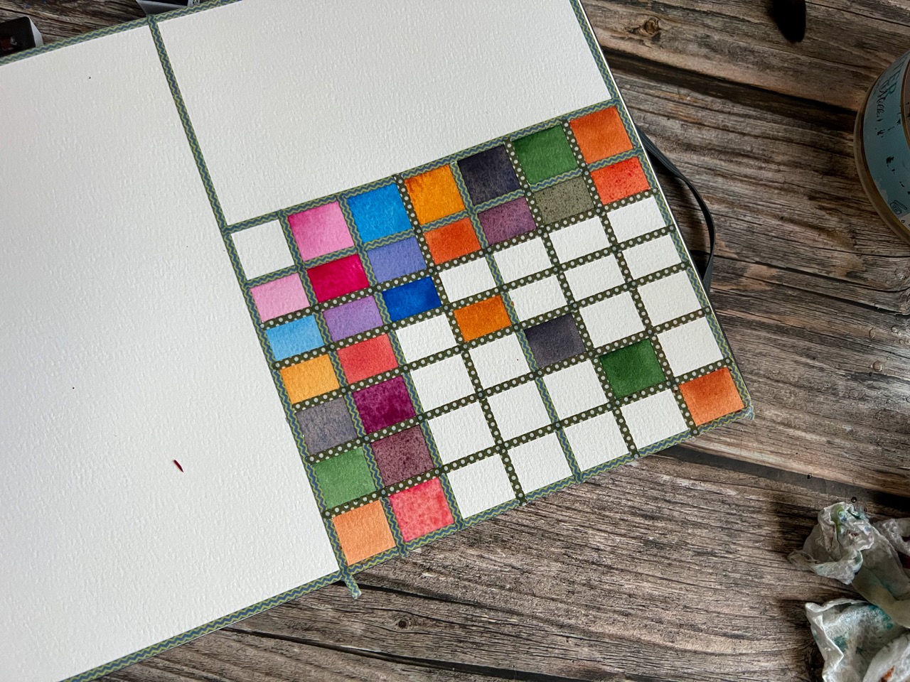
Here’s what it looks like once all the blue mixes are done:

Proceed in a similar fashion and complete the chart. I’m absolutely in love with the beautiful mixes these colors produced. The color “Deep Blue Night Cobalt” was an instant hit with me and it made the most interesting mixes in my opinion.


Ready to put your watercolor skills to use? The inspiration awaits.
Step 7: Make “Swatch Paintings”
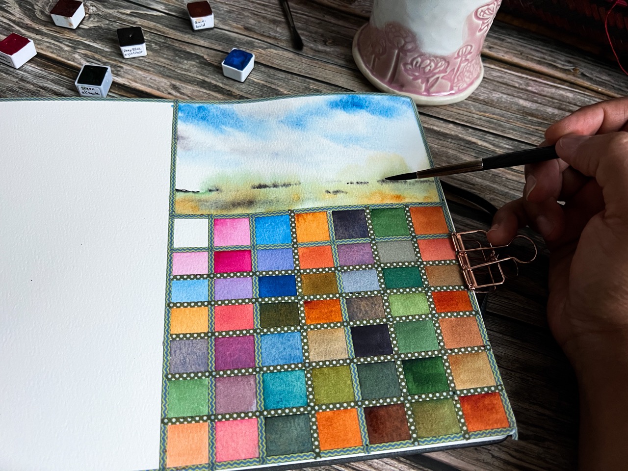
Now, we’re ready for our “swatch paintings”. I allow the colors to guide me in deciding what to paint to showcase them. Most often, I paint loose landscapes; this prevents the need to hunt for references. I use pinks and blues and moody grays for skies, purples for mountains, greens and yellows for foliage and the foreground , etc. If you are more comfortable using reference pictures, feel free to do so. For the first swatch painting, I stayed conservative and use the blue directly for the sky, and the grey like color for cloud shadows. I loved the mix the green and yellow made, so I used that for the foreground, adding a little grey for interest. The Quin Yellow dispersed beautifully and painted the distant trees by itself! Watercolor is absolute magic!
Step 8: Continue with “Swatch Paintings”
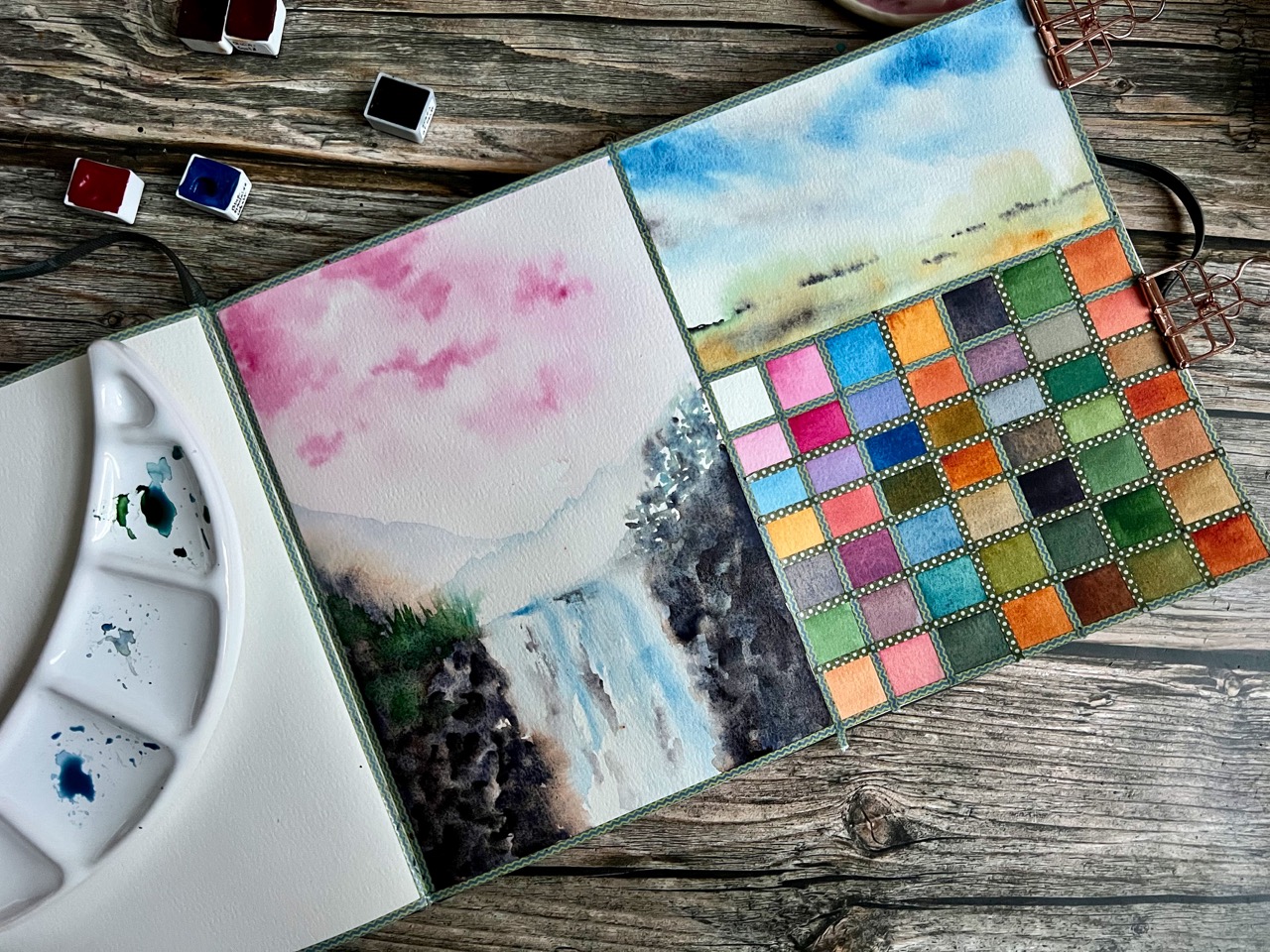
For the next painting, I chose to highlight the pink and for the final painting, I gave my “star” color a chance to shine! These were all painted intuitively, just letting the colors decide what they wanted to be. :)
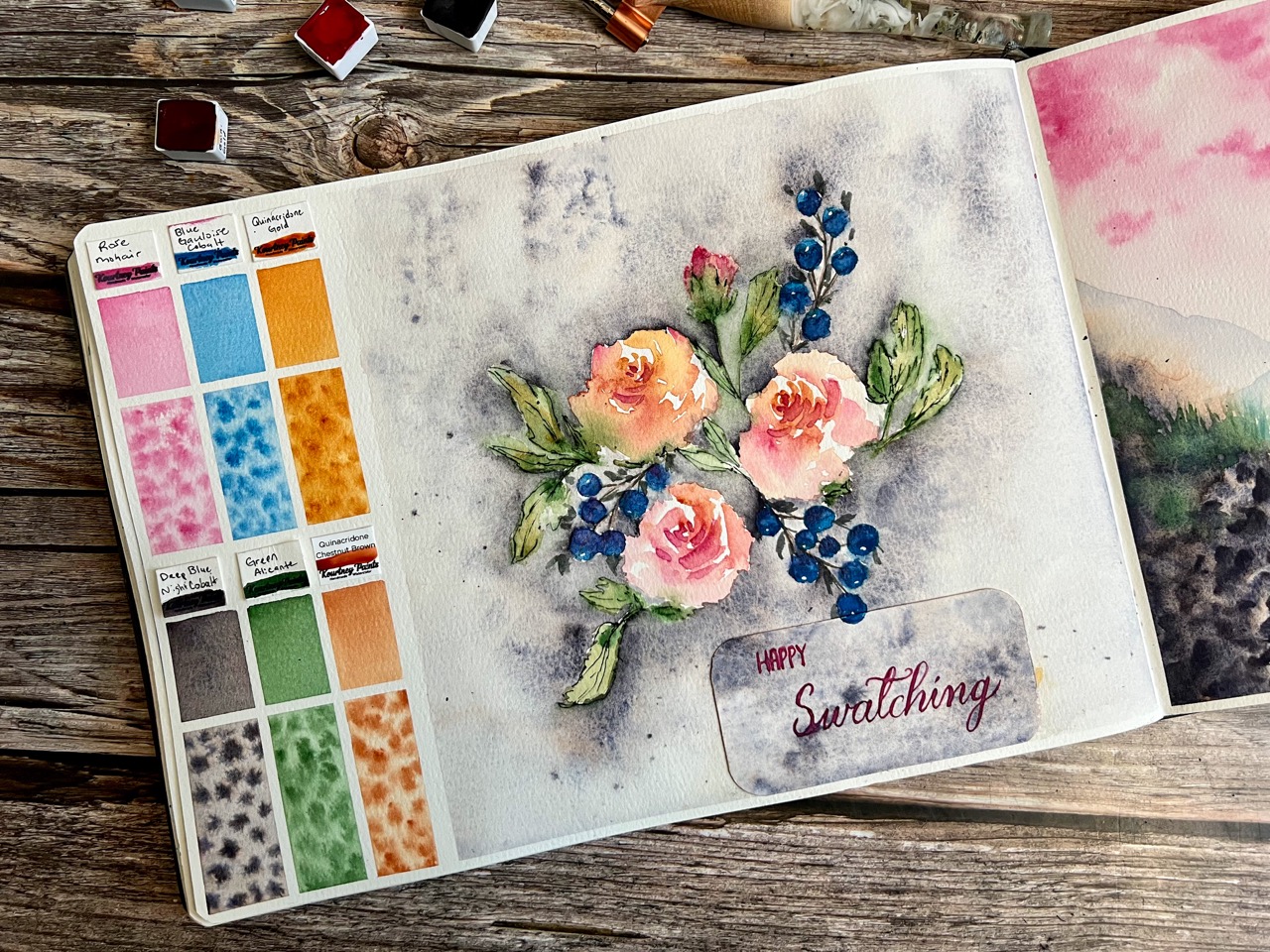
Step 9: Peel Off Tape and Enjoy!
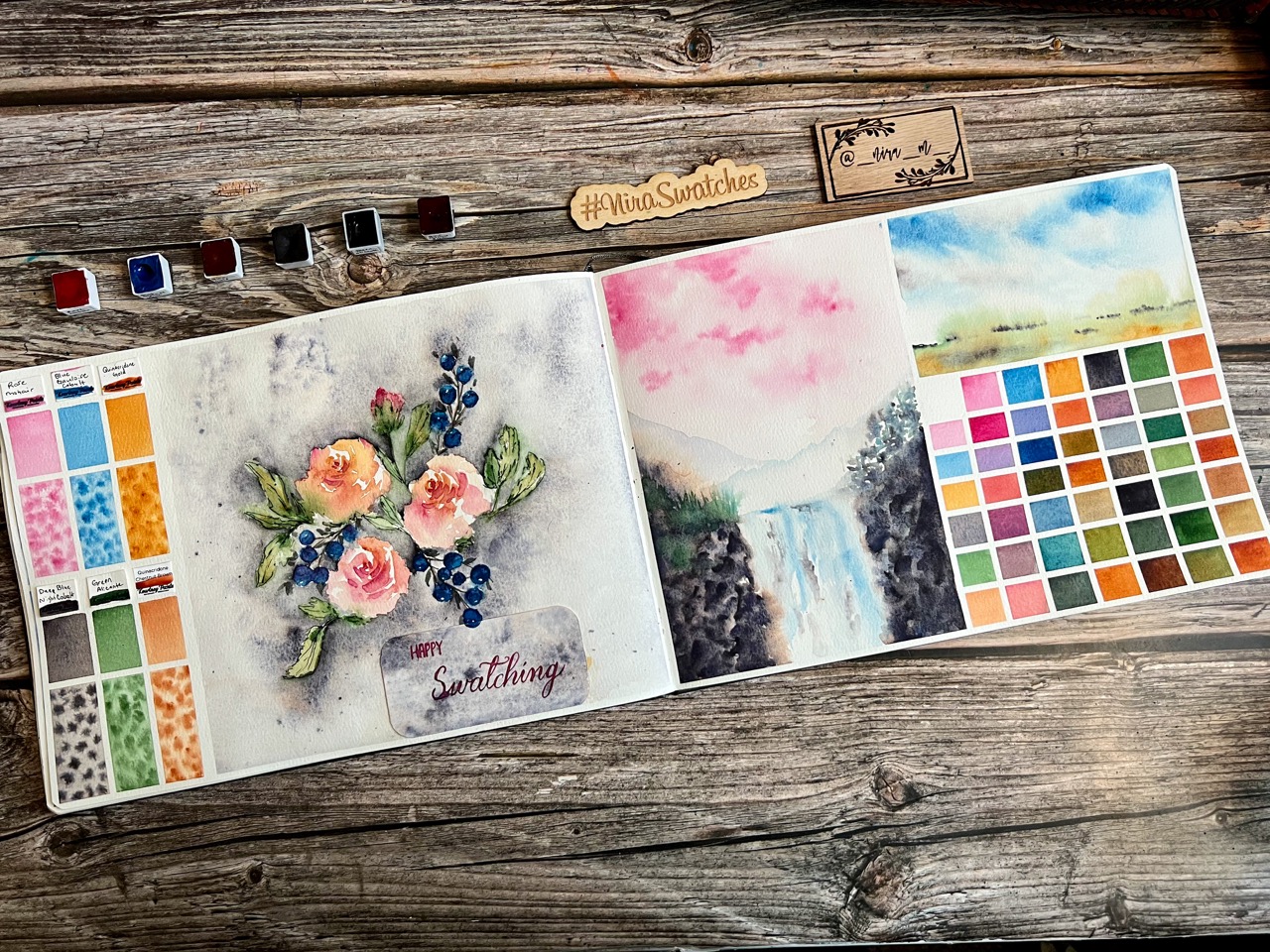
Carefully peel the tape off, pulling at it at an angle. That’s it! Now you know how to put your own swatch spread together. It looks rather dramatic when viewed all at once, but it is simple and therapeutic to do when done step-by-step.

Here’s the final spread, HAPPY SWATCHING!

Niranjana (Nira) is a self-taught watercolor artist. She is a Hardware Engineer by profession and has been painting almost every day since Watercolor Month in 2020. She loves all things art supplies and finds great joy in swatching paints from handmade paint makers. Nira shares her art regularly on her instagram account - @_nira_m_ . In addition to painting, she also makes paint and sketchbooks for herself and some friends. She likes to explore different subjects and likes to keep learning from books, tutorials and classes.

